The Sloan Digital Sky Survey has mapped over 3 million astronomical objects in 15 years.
Key Takeaways
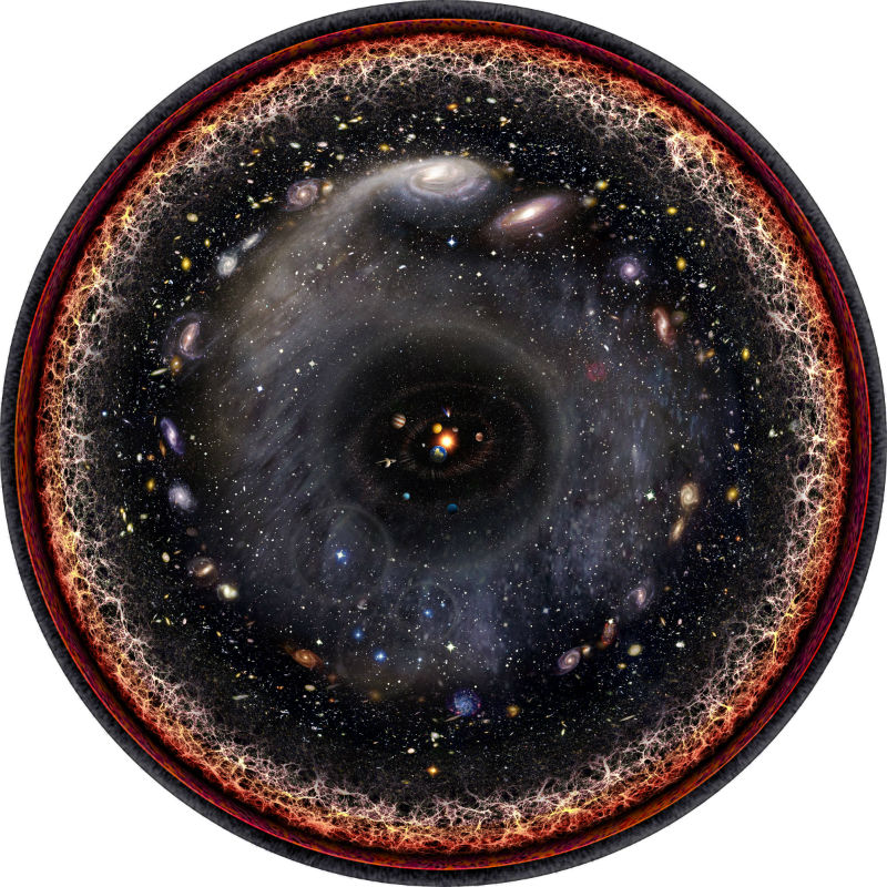
- A stunning logarithmic illustration maps the observable Universe with the Solar System at its center.
- The map showcases cosmic features, from nearby planets to the cosmic microwave background.
- Artist Pablo Carlos Budassi created this visualization, inspired by maps from Princeton researchers.
- Princeton’s Sloan Digital Sky Survey data provided the foundation for Budassi’s artistic creation.
- Logarithmic scaling offers a unique way to condense the Universe’s vastness into a single image.
_________
The Universe, Condensed Into a Stunning Logarithmic Image
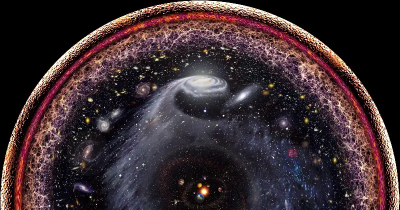
An extraordinary image by artist Pablo Carlos Budassi captures the entire observable Universe in one beautifully illustrated logarithmic scale. Centered around the Solar System, this visualization expands outward to depict planets, nearby galaxies, the cosmic web, and even the plasma left from the Big Bang.
This image is based on logarithmic maps created by Princeton University researchers J. Richard Gott and Mario Juric using data from the Sloan Digital Sky Survey (SDSS). Over 15 years, the SDSS has used a 2.5-meter telescope at Apache Point Observatory in New Mexico to produce the most comprehensive three-dimensional maps of the Universe. These maps include detailed data from more than 3 million astronomical objects and were published in The Astrophysical Journal in 2005.
Logarithmic maps are particularly effective for visualizing the Universe’s immense scale. Unlike linear maps, where increments are equal, logarithmic scales increase by orders of magnitude, allowing vast distances to be condensed into a single, comprehensible image.
Art Meets Science
Budassi’s inspiration for this cosmic masterpiece stemmed from an unexpected source: making hexaflexagons for his son’s birthday. The intricate polygons sparked the idea of visualizing the cosmos through a logarithmic perspective. Combining images from NASA and textures he created himself, Budassi brought his vision to life using Photoshop.
While the Princeton logarithmic maps are scientifically valuable, Budassi’s circular design is more visually engaging. His work illustrates the vastness of the observable Universe, beginning with the inner planets and extending to the outer edges of the cosmic microwave background.
Budassi’s work is not the only effort to visualize cosmic data. Researchers from the University of Hawaii have created another compelling visualization, mapping our Milky Way galaxy in relation to 100,000 nearby galaxies.
Both efforts demonstrate the power of blending art and science to help us grasp the incomprehensible scale of the Universe. Budassi’s image is an inspiring reminder of humanity’s ability to turn abstract scientific data into something accessible and awe-inspiring.



“Amazing post, keep up the good work!”
“Amazing post, keep up the good work!”
“Great content, learned a lot from this post!”